Blog Architecture
In my Hello, World! post, I mentioned that I might write about the tech behind the blog. Well, here it is!
The Source
I’m a big believer in open source. I’m also much better at learning by seeing/experiencing, rather than being told how something works.
You’ll find the source is linked on every page for your perusal. Feel free to check it out if you learn the same way I do!
Requirements
Before diving into the architecture, we need to backfill requirements that fit the choices I already made.
Performance
Web performance is important to me. Not because I think this blog will make more money (or any!) for each millisecond shaved off, but because providing a good experience is intrinsically important. The goal is to provide the most value while using the fewest resources. Why waste extra CPU cycles for the same result? That’s just wasted power, heat, and dead dinosaur juice.
In my work I deal with a lot of tricky performance issues. These are usually caused by three categories of issues:
- Assuming the network is fast and reliable
- Desire for rich journey / experience tracking
- Optimizing for developer productivity, rather than other resource efficiency
We’ll do our best to avoid them. We’ll aim to:
- Generate pages at build time, rather than request time
- Reduce network round trips and total payload size by:
- Inlining CSS and JS where it makes sense, and static separate asset sharing across pages where it doesn’t.
- Caching assets aggressively in the browser
- Skipping the more rich tracking like Google Analytics (bonus points for privacy, too)
- Serving appropriately sized images for devices (e.g. don’t bother with 4k images on a feature phone). Newer-gen formats like webp can help, too.
- Keeping in mind that this is a side project; time is not money and I can spend my hobby time building things efficiently, rather than fast.
Accessibility
Admittedly I don’t know much about accessibility; I barely know the acronym ARIA, but I do know that simpler, semantic HTML will end up working pretty well with accessibility tools like screen readers. I also know that an equitable web is important to me, even if I’m ignorant of some of its aspects.
Currently, the only place we use ARIA roles is in the nav element.
<nav>
	<ul>
		<li><a href="/" aria-current="page">Home</a></li>
		<li><a href="/about/">About Me</a></li>
		<li><a href="/posts/">Posts</a></li>
		<li><a href="https://gitlab.com/travisby/blog">Source</a></li>
	</ul>
</nav>
aria-current is a way to indicate in a list that the item is the “current” item, whatever that list happens to be (in our case, a list of pages!)
It’s nice to visually style the current page you’re viewing from a nav bar, and aria-current is a natural (albeit difficult to learn about) choice. Even more exciting, for visual styling, aria-current is actually a valid CSS selector!
[aria-current="page"] {
	font-weight: bold;
}
I’ll do my best to:
- Use semantic HTML (a LOT of accessibility comes for free with the right HTML element choice!)
- For any more custom components, ensure we set things like aria-role correctly
- Avoid more complicated dynamic UI elements from being critical to using the page (e.g. don’t make the page unusable without JS, or complicated inputs that are hard to navigate with just the mouse, just the keyboard, etc)
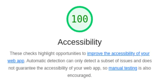
The one more concrete thing I understand, is lighthouse. Lighthouse is a tool that measures webpages for things like performance, accessibility, and SEO.
We’ll continue to monitor lighthouse, and at least keep the accessibility score at 100:
Writing simplicity
In Performance I mentioned that optimizing for developer productivity can sometimes be at odds with efficiency. I still want to aim for efficiency, but where it isn’t problematic… I’d still like things to be easier for me.
A great example of this, is not having to write every blog article with HTML, not having to manually update lists of posts in a few different places, etc.
Being able to use a CMS for writing, or even just markdown files and being able to have a few places where we can list out posts, is a great way to keep things simple for me.
Along with keeping things simple for me… I’m very much not a frontend engineer, nor a designer. I’ll need something that can look decent with minimal effort.
Toolchain
SSG
The above requirements lean heavily towards some kind of static site generation. Static Site Generators (SSG) almost all provide these features:
- Generate pages at build time (that’s literally what SSG means!)
- Generate CSS/JS with hashed filenames so we can more aggressively cache
- Utilize markdown for content
But, in particular, I’ve read good things about astro. Astro touts itself as content-driven. I took that to mean it was much more focused on blog-like sites, rather than far more interactive webapp type sites like next.js.
A second point Astro likes to advertise is Zero JavaScript. What better way to make the web more accessible than to not rely on JS? Sign me up! I’m sure plenty of other SSGs do that too, but I got pulled in by the marketing here.
Astro Features: Content Collections
We can write our blog posts in Markdown, and query them via content collections.
What’s neat about content collections is that the metadata is typed. Although we’re not using some of the fields yet, this is the content collection definition (including schema) so far:
import { z, defineCollection } from "astro:content";
import { glob } from 'astro/loaders';

export const collections = {
	posts: defineCollection({
		loader: glob({base: "src/data/posts", pattern: "**/[^_]*.{md,mdx}"}),
		schema: z.object({
			title: z.string(),
			publishDate: z.date(),
			tags: z.array(z.string()),
			description: z.string(),
		}),
	}),
};
We mostly only use the publishDate today for sorting, like in our RSS feed generation:
const posts = await getCollection("posts").then((posts) =>
	posts.sort(
		(a: CollectionEntry<"posts">, b: CollectionEntry<"posts">) =>
			a.data.publishDate.getTime() - b.data.publishDate.getTime(),
	),
);
I intend to modify the RSS feed and posts page to include filtering on tags in the future, so you don’t have to read about hiking if you’re only interested in tech!
Astro Features: Responsive Images
A newer feature of Astro we were able to take advantage of (post-decision) was the Responsive Images support that released in 5.0.
Here’s a sample image element in HTML you might see today:
<img
	src="/foo.jpg"
	alt="sample image"
	height="2160"
	width="3840"
/>
This is cool and all, and the browser (mobile or desktop!) will know how to shrink to fit the screen, but if it’s actually going to be displayed at 320 x 180, we’re wasting a lot of bandwidth and GPU cycles on the client side.
HTML introduced srcset as a feature around this (for both the <img> tag as well as <picture>, which is more for art direction) to help us serve more reasonable photos to smaller screens/devices.
<img
	src="/foo.jpg"
	alt="sample image"
	height="2160"
	width="3840"
	srcset="/foo-640w.jpg 640w, /foo-3840w.jpg 3840w"
	sizes="(max-width: 640px) 600px, 3840px"
/>
What will happen, the browser will use the media query in sizes, along with the actual screen size to determine which width of image it should use, and then it will pick the appropriate URI from srcset to grab the image corresponding with that size. That’s a mouthful, but the tl;dr is we can serve different images to different devices, ensuring we don’t waste nearly as much bandwidth sending a 4k image to a feature phone!
We don’t need anything special in an SSG to generate responsive images like this, but we do need:
- a list of image sizes (to throw into both the srcset and sizes attributes)
- An actual set of images for each of those sizes
And an SSG, including Astro as of 5.0 can generate all of those for us with a simple config block like:
import { defineConfig } from "astro/config";
export default defineConfig({
	image: {
		experimentalLayout: "responsive",
	},
	experimental: {
		responsiveImages: true,
	},
});
This will generate images for the their default list of resolutions, roughly for free effort on my part!
Astro Features: Markdown Plugins
Astro has a pretty complicated (to me!) build pipeline. One of the phases are remark/rehype plugins for markdown.
One of the super neat plugins I’ve found, is astro-diagram which lets you render mermaid charts directly in HTML, as you would on github.
As I’ll say a few times in this post: I’m not very good at making things pretty; if I can enter it in text and get a flowchart, that’s the best result for everyone :D.
It’s really simple (thanks to that complicated build pipeline) to add on here:
import { defineConfig } from "astro/config";
import remarkMermaid from 'astro-diagram/remark-mermaid';

export default defineConfig({
	markdown: {
		remarkPlugins: [remarkMermaid],
	},
});
In Optimizing Google Fonts in a few paragraphs, you’ll see some examples of these diagrams in action!
Hosting
While I run my homelab (another blog post, some day) roughly 24/7, I hate guaranteeing uptime. I do it enough at my day job! I don’t want to worry about a physical machine always running, even if it’s just a Turing Pi. That points us at a cloud solution.
I’m cheap, so that points us at free cloud solutions.
We’re a heavy user of Cloudflare at NerdWallet, and I’m a sucker for them. I love all of their worker/pages/data store features they come out with every few months.
We’ll spin this up as a Cloudflare Pages site (nit: after we launched, Cloudflare has started to consolidate their Workers feature with pages. I’m sure there’s a migration in our future).
Pages provide a few nice features:
- Built-in deploy hooks for astro and GitLab (it just says to do “npm run build”, but hey that’s deploy code I didn’t need to write)
- Preview environments (launch a copy of the site based on a merge request)
- The capability to use Page Functions (Workers) if I ever have anything requiring dynamic, server-side content (which based on our requirements, we don’t intend to use! But capabilities are fun)
- CDN builtin. It’s already in Cloudflare, we don’t need to throw a CDN on top!
An additional, neat feature that Cloudflare includes that we are not using: Cloudflare Image Optimization. Cloudflare can actually dynamically resize images (think back to our responsive images) with a URL prefix. We could specify an image: /cdn-cgi/image/width=640/foo.jpg to resize the image at /foo.jpg to 640px wide. This would mean Astro wouldn’t need to generate N actual copies of images (which might put us over some limit). This would be a lot less expensive in terms of build-time and storage.
This blog doesn’t use that feature, because of previews actually. Previews do not use your own domain name, instead using a subdomain of pages.dev. And pages.dev can’t enable the image transformation feature. That means if we were to use that feature, it would work on the actual blog, but never in previews! For simpler, working previews, today we rely on astro to generate the images and ignore this neat Cloudflare feature.
Design
Classless CSS
For the fifteenth time this post: I’m not a frontend engineer (not even mediocre). I’m bad at making things look pretty; the blog will need something that looks pretty, effortlessly.
When I first learned HTML (and then later CSS), it was taught to me that “You could have the same web page, and change out style sheets and have entirely different looking sites!”
As far as I’ve seen in my career - that’s been a total lie. CSS ends up tightly coupled to HTML with insane lists of class names and CSS selectors that are far too specific to an exact element.
I sought out something like the original dream — and I started reading about Classless CSS Frameworks. Classless frameworks are all about that original idea — swap out the CSS for an entirely different looking site! The styles in these style sheets are just on elements (e.g. table) and don’t require me to write HTML in any special way, or to think about how I want things to look (because I have no idea, I’m not good at that!)
I found pico.css which I really liked. It was pretty, modern, and simple to use. Unfortunately, it was pretty large too (in terms of bytes). Performance matters, and if we can find something smaller, I’d make the sacrifice.
Next I found dohliam’s classless CSS selector, a little JavaScript that would swap out style sheets via a drop-down. I added it to a local copy of the blog, and quickly scrolled through all of my options (on the existing blog! We know it’s classless because I changed nothing with the HTML!)
I eventually settled on magick.css which had a great balance of pretty, with size.
Optimizing Google Fonts
magick.css uses Google Fonts with an @import statement.
@import url('https://fonts.googleapis.com/css2?family=Averia+Libre:ital,wght@0,400;0,700;1,400;1,700&family=Averia+Serif+Libre:ital,wght@0,300;0,700;1,300;1,700&family=Caveat&family=Courier+Prime:ital,wght@0,400;0,700;1,400;1,700&family=Spectral:ital,wght@0,300;0,600;1,300;1,600&display=swap&family=Noto+Sans+Symbols+2&display=swap');When that URL resolves, it will look something like this
@font-face {
  font-family: 'Averia Libre';
  font-style: italic;
  font-weight: 300;
  font-display: swap;
  src: url(https://fonts.gstatic.com/s/averialibre/v16/2V0HKIcMGZEnV6xygz7eNjESAJFhbUTp.ttf) format('truetype');
}
...
...
This ends up being pretty inefficient with the ways the browser renders a page.
- Load https://travisby.dev (the HTML)
- Follow the
<link rel="stylesheet">for magick.css (even if we have Astro optimize it, it will likely become a separate included stylesheet, rather than an inline’d<style>on each page - especially because that’s wasted, shared bytes!) - Follow the
@importstatement
And for each of those requests, the page may have rendered and then re rendered! This is better known as Cumulative Layout Shift (CLS), and something to avoid for both aesthetics (who likes seeing elements shift on a page?) as well as performance — we should try to reduce the total number of fetches, or at least make them in parallel! In this case we have to download the next asset to download the asset after that.
This looks a little like this:
(Nit: It’s possible for the browser to wait when it knows fonts are on the
Google Fonts usually provides two ways to specify fonts:
- In a CSS file:
@import url('https://fonts.googleapis.com/css2?family=Averia+Libre:ital,wght@0,300;0,400;0,700;1,300;1,400;1,700&family=Roboto:ital,wght@0,100..900;1,100..900&display=swap');- In your HTML:
<link rel="preconnect" href="https://fonts.googleapis.com">
<link rel="preconnect" href="https://fonts.gstatic.com" crossorigin>
<link href="https://fonts.googleapis.com/css2?family=Averia+Libre:ital,wght@0,300;0,400;0,700;1,300;1,400;1,700&family=Roboto:ital,wght@0,100..900;1,100..900&display=swap" rel="stylesheet">
While @import makes perfect sense for the magick.css project (“Here’s one file you include, no more adjustments!”), the <link> format will be a little more optimized for us.
One way I attempted to fix that early on was with postcss-import-url, which would inline the @import in the generated stylesheet that Astro includes.
This produced this slightly more optimized sequence:
This approach had two faults:
-
The URL that was inline’d was:
https://fonts.gstatic.com/s/averiaseriflibre/v18/neIVzD2ms4wxr6GvjeD0X88SHPyX2xYGCSmqwQ.ttfAlthough I can’t find any documentation specifically saying it - that URL looks suspiciously like something that is generated, and won’t live forever! -
Google Fonts, when having the browser make a request to grab its stylesheet that includes the font, rather than the font itself, will actually do feature detection and serve up simpler font formats for browsers that don’t support it. This is actually something that postcss has to get around, see issue #6
So - this approach worked, and was live for some time, but it didn’t feel right.
So now we can’t necessarily trust @import, and we can’t just inline the results of the import - we’re at the point we need to manage the CSS file on our own, unfortunately.
In !10 we made a few changes to facilitate that:
- Stopped relying on the npm version of magick.css, and included the CSS directly. I love trusting imports and getting updates for free, but we have some changes to make and I’m not confident in my skills with things like postcss to do this directly!
- Added the Google Fonts
<link>to the<head>of the document. This will allow the browser to download the fonts in parallel with the CSS, rather than waiting for the CSS to download before starting the font download.
An awesome benefit of this approach is that Cloudflare will actually optimize away this exact approach (and no other approach like @import): Cloudflare Fonts. Cloudflare will actually remove the <link> tag for Google Fonts and inline the whole thing! This is the best of all worlds, we’re down to just the font download now, rather than downloading stylesheet to then figure out what font to download.
This ends up producing:
(Nit: in parallel, we do still fetch a CSS file for magick.css, but it no longer is in the critical path for font fetching. The key word here is parallel!)
CI Process
In Hosting we already mentioned that Cloudflare Pages has a built-in deploy hook for Astro. This ends up as a webhook added to the GitLab repo:
https://api.cloudflare.com/client/v4/pages/webhooks/scm/gitlab?eid=user:hunter2Simple!
We’ve also mentioned that any merge request turns into a preview build so we can look at things there.
One little extra addition I’ve added with GitLab actions is lighthouse testing (remember that from earlier?). I’ve added a job to the CI process that will run lighthouse on the preview environment, and then post the results as a comment on the merge request. So we can always know our score, and ensure we don’t let something like accessibility fall by the way-side!
We first start by having a light house configuration file, .lighthouserc.json
{
	"ci": {
		"collect": {
			"numberOfRuns": 1,
			"maxAutodiscoverUrls": 0,
			"autodiscoverUrlBlocklist": [
				"/resume/index.html"
			]
		},
		"assert": {
			"preset": "lighthouse:recommended",
			"assertions": {
				"max-potential-fid": "off",
				"lcp-lazy-loaded": ["warn", {"maxScore": 1}],
				"uses-responsive-images": ["warn", {"maxLength": 1}],
				"uses-rel-preconnect": ["warn", {"maxLength": 1}],
				"bf-cache": "off"
			}
		},
		"upload": {
			"target": "filesystem",
			"outputDir": "ci/"
		}
	}
}
This does a few things:
- It enables auto-discovery, so we can run lighthouse on every page, without having to list them out ourselves (or generate from the sitemap, which was my original plan…)
- We disable existing checks that fail 🙈. Some of these fail due to running them locally vs in Cloudflare where a few more optimizations are assumed to be in place.
- We specify the report directory, so we can run a script on it later.
That already works locally! If we run npm run build && lhci autorun, we’ll see results!
But for that to run in CI and produce a report on every merge request, we update our .gitlab-ci.yml:
build:
  stage: build
  image: node:lts
  script:
    - npm install
    - npm run build
  artifacts:
    paths:
      - dist/
lighthouse:
  image: registry.gitlab.com/gitlab-ci-utils/lighthouse:latest
  stage: test
  dependencies:
    - build
  script:
    - lhci autorun
  after_script:
    - node -e 'console.log( JSON.parse(require("fs").readFileSync("/dev/stdin")).map(x => Object.entries(x.summary).map(y => `lighthouse{url="${url=x.url.split("/").slice(3).join("/")}",category="${y[0]}"} ${y[1] * 100}`).join("\n")).join("\n") );' < ci/manifest.json | tee metrics.txt
  artifacts:
    when: always
    reports:
      metrics: metrics.txt
Besides the obvious npm run build and lhci autorun, the after_script will parse the lighthouse results as JSON and convert them into the prometheus format, which is also the GitLab metrics report format, looking a little bit like this:
lighthouse{url="index.html",category="performance"} 93
lighthouse{url="index.html",category="accessibility"} 100
lighthouse{url="index.html",category="best-practices"} 100
lighthouse{url="index.html",category="seo"} 100
lighthouse{url="about/index.html",category="performance"} 90
lighthouse{url="about/index.html",category="accessibility"} 100
lighthouse{url="about/index.html",category="best-practices"} 100
lighthouse{url="about/index.html",category="seo"} 100
...
And, if I paid for GitLab Giga Ultimate Pro XP Edition, we would see something like this on MRs:
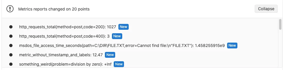
Alas, that’s not a feature for GitLab free tier, so instead we either look at the generated metrics.txt file in the artifact list, or at the job output.
Maybe one day we’ll add our own custom CI check that compares the current artifact to the main branches artifact.
Another fun CI check would be for broken links — I really don’t trust how links are generated!
Final Thoughts
I mentioned in Hello, World! that I wanted to write a blog, not because I have anything interesting to say, but because it’s just another fun piece of tech to play with.
I work with a lot of more frontend-minded engineers in my day job, and I want to empathize with their pain understand their experience more so I can be a better partner.
I think it’s important for any engineer to understand 1-2 layers of abstraction below and above their place in the stack. I think it’s important for someone that specializes in React to still understand how the browser might actually render (or re-render), and some bits of the HTTP spec like how the Cache-Control header works. Likewise, with my experience much more on the server side of things, I need to understand how the heck building a website works outside of w3cschools’ tutorials from 2004.
So here I am, trying!